Thanks to Michele Gorman for dropping by CLP yesterday with a fab article on cover design! Her thoughts sparked an interest in me to get more input on covers, and I want to thank Sara Palacios, Cat Lavoie, Samantha Stroh Bailey and Laura Chapman for weighing in their thoughts on covers.
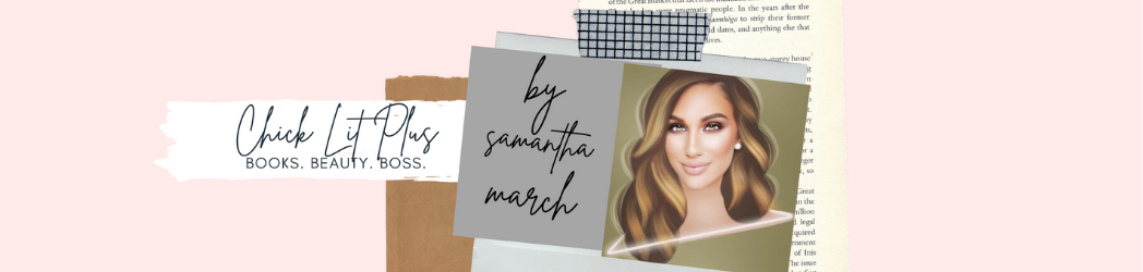
 My Thoughts: “Covers are a tricky thing, both for readers and authors. I will admit – I have turned down book review requests because the cover didn’t look up to snuff. I don’t want to say I’m always judging a book by its cover, but your book needs to be polished and put together from the whole – that includes a great plot and characters, a solid synopsis to reel me in, and of course – a great cover. As an author, cover design can be a difficult process. It’s especially tough when you have a vision in your head, but no matter how many times you make tweaks and suggestions, you just can’t get them to match up. For authors looking to design a cover, I recommend having a few different design ideas, and being very open with your designer throughout the process.” – Samantha March, book blogger, author and publisher
“I started thinking about the cover for BREAKING THE RULES before I even finished the first draft. I knew there was going to be lots of pink. And that’s pretty much all I knew. When the time came, I hired a graphic designer and sent him links to covers that I loved but I wasn’t able to tell him exactly what I wanted for mine. So I sat down with pieces of cardboard and brightly colored pencils and started drawing. It only took a few seconds for me to remember that I can’t draw to save my life. Still, I sketched away until there was barely a square inch of blank space on the paper. It was a jumbled, cramped mess but it helped me figure out what I really wanted on the cover: a red telephone box, a yellow taxi and a cupcake. A friend of mine (who can actually draw) made a new sketch with those elements and I sent it over to my designer. It took a few tries to get the colors right but I fell in love with the final version. Since the red telephone box replaces the I in Breaking, I’m hoping to do something similar for my second novel’s cover.” – Cat Lavoie, Author, Breaking the Rules
“As an avid reader and also as a book reviewer for Chick Lit Plus, I receive quite a few books on a weekly basis. With that being said, I definitely judge a book by its cover and have found that I am far less eager to read a book that isn’t aesthetically pleasing in comparison to one that I find visually appealing. So, that probably makes one wonder what I would find appealing, huh? Well, the honest answer is that it varies. I am a sucker for soft fonts, as well as simple covers without too much going on. If a book has a million colors and is bright and bold, I feel like it is way too busy. I also really dislike covers that have an image in the background, instead of front and center. With me, simplicity is key. I’ve always felt that the focus should be on the story on the inside of the book instead of the cover. Now obviously I have read and loved dozens of books with terrible covers, but I have noticed that they are usually recommended to me, and not something I’ve personally picked up at the bookstore. I guess beauty really is in the eye of the beholder, eh?” – Sara Palacios, book blogger, Chick Lit Plus
 “As a voracious chick lit reader, I know exactly what will catch my eye in a book cover. I like simple covers with bright colors, swirly or block writing and a photograph or drawing that hints at what delicious surprises are in store for me. Sounds straightforward, doesn’t it? Well, when I had to actually design my own cover for Finding Lucas, I couldn’t articulate what I wanted beyond the words “magenta” and “chick lit.” Having no sense of the visual—all of the photos I snap make people ask, “What is that?”—I had no clue what I wanted, but I knew I’d know when I saw it. I love Emily Giffin’s covers because they usually have a single image on the page that stands out like an engagement ring, a gift box or a key. After bombarding my poor graphic designer with panicky emails, it finally hit me which three things my cover needed to fully convey Jamie’s journey: a high school yearbook, a photo of Lucas and old letters. When I saw my cover, I cried. Of course, now I see all of the things I would like to change, but luckily, I have a better eye and the experience for when my second book comes out.” – Samantha Stroh Bailey, Author, Finding Lucas
“The front cover of a book is usually the first glimpse a reader has of a story. You never get a second chance at a first impression, which is why good covers matter.
For me, the title is most important, because it offers the most insight into a book. In addition, the title should be displayed well in a visually appealing font, size and color. As a part-time designer, I geek out for quality typography that conveys a story, because it can. Consider Emily Giffin’s books. Their design is minimalistic, giving the title prominence. I love that. When a title appeals to me, I pick up the book, flip the cover to read the description and ultimately decide if this book goes home with me. By this point, it usually does.
Conversely, I will spend tens of minutes standing in front of the display of romance novels at my local grocery store. It is dome of the best entertainment I get while running errands. From a design standpoint they are not impressive, but my goodness the titles are fantastic. Plus, have you seen those cover photos? I could stare at pictures of topless cowboys/doctors/nobles/millionaire moguls all day. Unfortunately, it does not always guarantee I will buy the book, but will leave me with a smile.” – Laura Chapman, book blogger, Change the Word
